Guides · September 20, 2026 · 12 min read
The New Whistlr Home Feed, Explained: The Card Grid, Friends-First Balance, and How to Tune It
The new Whistlr home feed swaps one long column for a scannable card grid, keeps friends first and shows who posted what. Here's how to tune it to you.
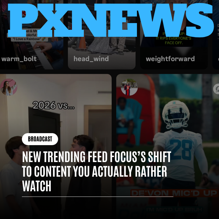
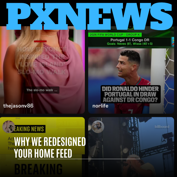
The new Whistlr home feed replaces a single long column with a card grid you can scan at a glance. Each card shows a strong visual, a headline or hook right on the card, and the poster's username in the same readable spot every time. Every post type gets a presentation that suits it, so a written Thought isn't buried under videos. Your friends, the creators you follow and your Circuits still lead, and timely news, sports and cultural moments fill in around them, clearly labeled. You shape what you see with saves, comments, “not interested,” hides and mutes. That's the whole change in a paragraph; the rest of this guide explains the reasoning and shows you how to make the feed your own.
Your home feed is the first screen you see when you open Whistlr. For plenty of people it's the only screen they see before deciding whether the app deserves their next ten minutes. That's a lot of weight on one screen, which is why we rebuilt it.
What's new in the Whistlr home feed?
The old home feed was designed for an earlier Whistlr with fewer post types, fewer communities and less going on. As the platform grew to include Minis, Stories, Thoughts, Waves, Circuits and SubCircuits, live streams, Storefronts and a Trending tab that pulls in the wider world, the home feed kept trying to stack all of it into one uniform column. It worked. It just didn't work well.
People told us the same things in different words. The feed felt long but not deep: they scrolled past a lot without really seeing any of it. Text posts got lost under media-heavy cards. It wasn't always clear who a post was from, or why it was there. And the moments everyone was talking about, a big game or a major story, didn't always show up when they mattered.
| Old home feed | New home feed |
|---|---|
| One tall card filling the screen at a time | A grid that shows several posts at once |
| Every post type squeezed into the same shape | Each post type presented in a way that suits it |
| Usernames easy to miss when media filled the card | The poster's username in a consistent, readable spot on every card |
| Text posts overshadowed by images and video | Thoughts and text-first posts given room to be read |
| Big moments that sometimes surfaced late | Timely news, sports and culture woven in, clearly labeled |
The home feed is the front door to Whistlr. If it opens onto a wall of stuff, people glance and leave. We wanted a door you could open and immediately understand: who's here, what's happening, and what's worth tapping.
— The Whistlr product team
Why the Whistlr home feed moved from one column to a card grid
In a single column, the feed decides what you look at next. You scroll until something happens. In a grid, you take in a page of options, pick the one that interests you, and tap in. It's closer to scanning a magazine rack or a newspaper's front page than to waiting for the next thing to be handed to you.
That sounds small. In practice it changes who's in control. The old layout's low information density meant you could see one or two things at a time, so getting a sense of what was going on took a lot of scrolling. The grid lets you understand the shape of your feed in a couple of seconds and choose what's worth your attention.
Headlines and hooks on the card
Many posts now show their key text directly on the card: a headline, a question, or a caption that tells you what you're about to watch or read. A sports clip asking whether a player cost his team the result, an entertainment story that just broke, a creator explaining the history behind a moment that went viral. You know what each one is about before you tap, which helps you find what you want and skip what you don't.
Who posted it, every time
Every card carries the poster's username in the same readable place. On a platform built around real relationships, knowing who something is from is often the most important thing on the card. A post from your closest friend and a post from a news outlet you follow should never feel interchangeable, and the grid makes sure they don't.
How each post type looks in the new home feed
One principle behind Whistlr's home surfaces, Haven and Chattr, has always been rendering every post type honestly, so a thoughtful text post isn't buried just because images and video happen to catch the eye faster. The redesign doubles down on that.
| Post type | How the card presents it |
|---|---|
| Minis | A video-forward card |
| Photo posts | The image leads |
| Thoughts and text-first posts | The words are the star, not a line squeezed under a thumbnail |
| News and editorial content | A clear headline treatment |
| Live streams | Marked as live, so you know something is happening right now |
This matters beyond looks. When a feed makes one kind of post look more important by default, it quietly trains everyone to make more of that kind. Platforms whose layouts favor flashy video end up with feeds full of flashy video and little else. Treating post types fairly keeps your home feed varied: a real mix of how people actually express themselves.
One person who mostly posts written Thoughts told us that on the old feed their posts seemed to vanish next to everyone's videos. On the new one they actually look like something, and friends have been replying to them far more, which was the reason for posting them in the first place.
Will I still see my friends first?
Yes. A redesigned feed could easily have become a redesigned way to push more strangers at you. That isn't what this is. The Whistlr home feed still leads with the people and communities you chose: friends, creators you follow, and the Circuits and SubCircuits you belong to. Friend-first discovery is the foundation the redesign sits on.
What's new is a better way to let the wider world in without letting it take over. People told us they want to know what's going on, the big game, the major story, the moment everyone's discussing, without leaving Whistlr for another app. The grid makes room for that. Timely news, sports and cultural moments can appear beside posts from your own world, clearly labeled and clearly attributed.
- Your people lead: posts from friends, followed creators and your Circuits remain the heart of the feed.
- The world fills in context: timely news, sports and culture appear when they're relevant, so you're not out of the loop.
- Everything is labeled: you can always tell whether a card is from a friend, a creator, a community or a news source.
- You stay in control: feedback tools let you tell the feed what you want more or less of.
We will never build a home feed where you have to hunt for your friends between ads and strangers. Putting attribution on every card makes that harder to do by accident. What the redesign adds is a sense of the world around you, so Whistlr is where you find out what's going on, not only where you check your group chat.
— The Whistlr product team
What decides what shows up in your Whistlr home feed?
The grid is what you notice first, but the redesign also reflects how we think about ranking across Whistlr. The core idea is that engagement on its own is a poor stand-in for value. What matters is what's genuinely worth your time, and deliberate actions say more about that than passive ones.
| Your action | What it tells your home feed |
|---|---|
| Like | A baseline signal of interest |
| Save | A stronger signal: you want to come back to this |
| Comment | Stronger still: it was worth responding to |
| Share or Boost | You put your own name behind it |
| Tapping a card from the grid | More meaningful than scrolling past it, because you chose it |
| Skipping within a few seconds | It didn't land |
| “Not interested,” hide, mute or report | Clear, deliberate signals about what you don't want |
Negative signals are something many feeds ignore. On Whistlr they count. A post that racks up reactions while people are actively trying to get away from it doesn't get rewarded just for being loud. Video in your home feed also benefits from the shift we made on Trending toward what people watch through and come back to, which we covered in its own piece. Here, the bigger change is the grid itself: because you pick from a page of options, what you choose to open is a clearer signal than what drifts past you in a column.
How to customize your Whistlr home feed
The new feed should feel natural from the first open, but a few habits make it yours faster. None of them take more than a second.
- Scan before you scroll. Look over the grid, pick what genuinely interests you and tap in. The feed learns from what you choose, not just from what passes by.
- Save what you want to return to. Saves are one of the strongest signals of real value, and they make things easy to find again.
- Use “not interested” freely. It's weighted heavily because it's deliberate, so it reshapes your feed quickly.
- Hide or mute sources that have worn thin. You can turn something down without unfollowing anyone or making a fuss.
- Join Circuits that match your interests. Your communities feed directly into your home screen, so the more they reflect you, the better your feed gets.
- Follow people you actually want to hear from. Friend-first works best when your follows reflect real interest rather than obligation.
- Open Trending for the bigger picture. Your home feed brings in timely moments, but Trending is still where you see what's moving across hashtags, news and communities.
A home feed you can actually finish
There's one more goal that's easy to miss, because it's about what the feed doesn't do. Most social feeds are built to be bottomless. There's always one more card and one more reason not to put the phone down, and the design quietly works against the moment you decide you've seen enough. We don't think that's a feature. We said Trending should be easy to understand and easy to walk away from, and the home feed now follows the same rule.
A grid helps more than you'd think. When you can see what's on the page, you can tell quickly whether there's anything you want right now. If there isn't, you can close the app without feeling that something important is hiding two hundred scrolls down. Picture someone on a ten-minute break between shifts: they catch up on their people, glance at the score and the headline everyone's talking about, and get on with their day. That's a completely valid way to use Whistlr, and the new home feed is designed to make it feel good rather than like a failure to engage.
What the new home feed means for creators
For creators, the grid changes how your work is first seen, and mostly in your favor. In a single column, your post only had a chance if someone landed on it mid-scroll. In a grid, it sits beside others and gets chosen, which gives a strong visual and a clear hook real power.
- Your cover matters more than ever. The thumbnail or first frame does the work of getting picked, so make it clear, readable and true to what's inside.
- Your hook should be honest. On-card headlines help people choose your post, but if it doesn't deliver, quick skips and negative signals will catch up with it.
- Your name builds recognition. With consistent attribution on every card, viewers learn to spot your posts in the grid over time.
- Writers get a fair shot. Fair rendering means commentators and text-first creators aren't penalized by the layout for not posting video.
- Creator Studio still guides you. The audience insights at whistlr.studio show what your followers choose, finish and come back to.
A creator who covers sports and pop culture told us their posts are essentially a headline and a take. In the new grid, people can see the question on the card before tapping, and replies have picked up noticeably. That's the pattern we expect: creators who already did the fundamentals well, clear visuals, honest hooks and posts that pay off, now get those fundamentals seen.
What we're still tuning in the home feed
A home feed is never finished, and we'd rather be upfront about where the work continues. We're still adjusting how often news, sports and cultural moments appear relative to posts from your own world, based on how people use the new layout. We're refining how each post type sits in the grid so every one feels right. And we're working on how the home feed can better explain why a given post is there, because a feed that explains itself earns more trust than one that doesn't.
Support conversations, app reviews, and discussions inside Circuits and group chats all shaped this redesign, and they'll shape what comes next. If something isn't working for you, the feedback tools in the app are the fastest way to change your own feed, and your broader feedback is how we change it for everyone.
Frequently asked questions
Why did Whistlr redesign the home feed?
The old single-column feed no longer fit how people use Whistlr. It showed too little at once, buried text posts under media, made it hard to see who posted what, and surfaced big moments late. The new home feed is a scannable card grid with clear attribution, fair treatment of every post type, and a better balance between your people and the wider world.
What does the new Whistlr home feed look like?
It's a card-based grid that shows several posts at once instead of one tall card at a time. Each card has a strong visual, a headline or hook on the card where it helps, and the poster's username in a consistent spot. Minis, photos, Thoughts, news and live streams each get a presentation that suits how they were meant to be seen.
Does the new home feed still show my friends first?
Yes. The Whistlr home feed remains friend-first. Posts from friends, creators you follow, and the Circuits and SubCircuits you belong to are still the heart of it. Timely news, sports and cultural stories appear around them when relevant, and every card is clearly labeled and attributed so you always know where a post came from.
How can I customize my Whistlr home feed?
Choose what you open from the grid, save posts you'd want to see again, tap “not interested” on things that aren't for you, hide or mute sources that have worn thin, and join Circuits that match your interests. The feed weighs these deliberate signals heavily, so it becomes more personal the more honestly you use them.
How does the Whistlr home feed decide what to show me?
It gives deliberate actions more weight than passive ones. A like is a baseline signal, while saves, comments, shares and Boosts count for more. It also listens to negative signals such as quick skips, “not interested,” hides, mutes and reports. Because you pick posts from a grid, what you choose to open tells the feed more than what you scroll past.
What should creators change for the new home feed grid?
Make your cover or first frame clear and representative, write an honest hook that the post actually delivers on, and make content people finish and return to. Consistent usernames on every card help viewers recognize your work over time, and Creator Studio at whistlr.studio shows what your audience chooses and engages with.