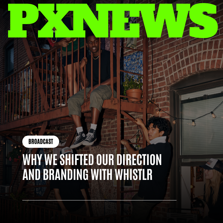
Company · August 8, 2026 · 7 min read
From One App to Four Products: The Business Case Behind Our Rebrand
Our new visual identity started as a business question, not a design one — could a brand built for one app credibly represent four. It could not.
The question that started the rebrand wasn't "what should our new logo look like." It was a plainer, more uncomfortable one: does the identity we built years ago still describe the company we've actually become? Once that question got asked seriously, in a room with the actual growth numbers on the table, the honest answer was no. The design work that followed was the easy part. The hard part was admitting the old identity had quietly stopped fitting.
The company the old branding was built for no longer exists
When the original Whistlr identity was designed, that description was basically accurate: ETAPX was one product wearing a company name. Every branding decision made sense under that assumption — the visual identity, the tone, the positioning all pointed at one audience, one use case, one product experience. And it worked. The old branding did exactly what it was supposed to do at the time, which was get a new streaming app noticed in a crowded market full of platforms that had years of head start.
The problem is that a brand identity is a snapshot of a company at the moment it's designed, and companies don't hold still. ETAPX grew from that one-product snapshot into a family of four distinct products — Whistlr, GLSRM, Ocsidian, and Influxx — each one built for a genuinely different audience, with different expectations about what the product should feel like. A brand identity calibrated for one product, one audience, one specific moment cannot stretch to credibly cover that without changing.
Why "just add a new logo for each product" doesn't actually work
The tempting shortcut when a company outgrows its branding is to leave the original identity alone and just bolt a fresh, unrelated logo onto each new product as it ships. It's faster, and each new logo can be tailored perfectly to its own product without any compromise. It also creates a specific, cumulative problem: nothing signals that these products come from the same company, built by the same team, held to the same standard.
That matters more as a company grows, not less. A user who trusts Whistlr because it's been reliable has no reason to extend that trust to Ocsidian if nothing about Ocsidian visually says "same people who built the thing you already trust." Four unrelated identities under one company name isn't neutral — it's a quiet tax on every new product's ability to borrow credibility from the ones that came before it.
The other failure mode: one flagship, three afterthoughts
The opposite mistake is just as common: keep the original Whistlr identity exactly as-is because it's the biggest, most recognized product, and let the newer products awkwardly reference it without a real design relationship. That approach quietly tells everyone — customers, partners, even the team — that Whistlr is the real business and everything else is a side project. For a company that's actually betting on all four products mattering, that framing works against the strategy instead of for it.
This was a business decision before it was a design decision
It's worth being direct about the order of operations here, because it's easy to assume a rebrand starts in a design tool. This one started in a strategy conversation about what ETAPX actually is now versus what it was when the original branding was created. The design work — the new mark, the new visual system — came after that conversation settled, as the execution of a conclusion the business had already reached, not as the thing that triggered it.
- Question one: is ETAPX still, functionally, a single product wearing a company name? No — it's four products with four distinct audiences.
- Question two: does the current identity represent that reality, or does it still represent the smaller company from years ago? It represented the smaller company.
- Question three: can that gap be closed with a small tweak, or does it require rebuilding the identity from its underlying logic up? It required rebuilding from the logic up.
We weren't unhappy with how the old branding looked. We were unhappy with what it was being asked to represent — a company four times the size of the one it was built for.
— ETAPX leadership, on the decision to rebrand
What we learned from getting the timing wrong once already
It's worth being honest that this wasn't the first time the question of a rebrand came up internally. An earlier version of this conversation happened while GLSRM was still early and Ocsidian and Influxx hadn't shipped yet, and the team decided against acting on it — the case for four products needing a shared identity is much weaker when only two of the four actually exist yet. Rebranding too early, around a plan rather than a reality, risks building an identity system for products that might still change shape before they ship.
Waiting had a real cost — every month on the old identity was another month of the four products drifting further apart visually, with no shared language pulling them back together. But rebranding around a roadmap instead of a shipped reality carries its own risk: you end up designing for products that don't exist yet in their final form, and the identity has to be reworked again once they do. Once all four products were live and being used by real audiences with real, distinct needs, that risk disappeared and the original case became something the team could act on with confidence instead of a bet on where the roadmap might land.
What this means if you use Whistlr specifically
If your relationship with ETAPX is entirely through Whistlr, the direct product impact of this shift is small — Creator Studio, Flow, Gems, and every other tool you already use work exactly the way they did. What changes is context: Whistlr now visibly sits inside a family of products with a shared visual language, rather than standing alone as ETAPX's only identity. That's a signal about the company's trajectory more than it's a change to your workflow — evidence that the team behind Whistlr is investing in infrastructure and consistency across a growing portfolio, not just patching the one app you already rely on.
What we'd tell another company facing the same choice
The instinct when a brand starts feeling like a poor fit is to treat it as a design problem first — get a new logo made, update the color palette, move on. That instinct is backwards, and it's the mistake worth naming plainly for anyone else about to go through this. A rebrand that starts with the visuals and works backward toward a justification produces a nicer-looking version of the same confusion. A rebrand that starts with a clear-eyed answer to "what is this company actually now" produces an identity that can survive contact with the next few years of growth instead of needing another rework the moment a fifth product ships.
The other lesson was about sequencing inside the company itself. Design, product, and leadership all needed to agree on the answer to that underlying business question before a single mockup got made, because a design team asked to solve an unresolved strategic question ends up guessing — and guesses show up in the final product as indecision, as an identity that hedges instead of commits. Settling the business question first meant the design brief that followed was narrow and specific rather than open-ended, which is a large part of why the resulting identity feels deliberate rather than exploratory.
The honest summary
Rebrands earn a bad reputation because a lot of them are cosmetic — a company gets bored of its own logo and refreshes it for the sake of refreshing it. This one wasn't that. It started with a specific, answerable business question about whether an identity built for a single product could still honestly represent a company that had grown into four, the answer was no, and the new visual system is what it took to make the answer yes again.
Frequently asked questions
Why did ETAPX rebrand?
ETAPX rebranded because its original identity was built when the company was essentially one product, Whistlr, and it no longer described the company. ETAPX had grown into four distinct products, Whistlr, GLSRM, Ocsidian, and Influxx, each for a different audience. The rebrand started as a business decision about what the company had become, and the new visual system followed from that conclusion.
What products does ETAPX make?
ETAPX makes four distinct products: Whistlr, GLSRM, Ocsidian, and Influxx. Each is built for a different audience with different expectations of what the product should feel like. The company's rebrand created one shared visual language across all four, so they read as products from the same team held to the same standard, without any single product looking like the priority.
Does the ETAPX rebrand change how Whistlr works?
No. For people who use Whistlr, the rebrand's direct product impact is small. Creator Studio, Flow, Gems, and the other tools work exactly as they did before. What changes is context: Whistlr now sits visibly inside a family of ETAPX products with a shared visual language, rather than standing alone as the company's only identity.
Why didn't ETAPX just give each product its own logo?
Giving each product an unrelated logo would have been faster, but nothing would signal that the products come from the same company and team. That makes it harder for a newer product like Ocsidian to borrow the trust users already have in Whistlr. ETAPX also rejected keeping Whistlr's identity as the flagship and letting the others reference it, since that would frame the other products as side projects.