Company · August 11, 2026 · 7 min read
New Logo, New Icon: What Changed and Why It's Not Cosmetic
ETAPX and Whistlr have a new visual identity across the app, site, and socials. Here is what changed, why it was tested at icon size, and what it signals.
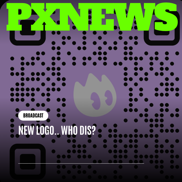
If you opened Whistlr this week and your home screen icon looked slightly different, that wasn't a rendering glitch or a rogue cache. ETAPX shipped a new logo — not a filter, not a seasonal skin, a permanent replacement rolling out across the app, the website, social profiles, and eventually merch. It's a small enough change that most people will register it as "huh, that looks different" before they register exactly what changed. That reaction is actually the point.
Why a logo that already worked needed replacing
The old mark wasn't broken. It did the job it was built for — get a new app noticed in a crowded field, signal something a little different from the streaming platforms already out there. But it was designed for a much smaller company at a much earlier moment, back when Whistlr was the entire company rather than one product inside a growing family. A logo built for a five-person team's first launch and a logo built for a company running multiple products at scale are, reasonably, not the same logo.
The tell was in the small sizes. A brand mark lives most of its life tiny — an app icon on a crowded home screen, a favicon in a browser tab crammed between a dozen others, a profile picture the size of a thumbnail in someone's notifications. The old logo had detail that made sense at poster size and disappeared at icon size, which meant the version of the brand most people actually saw most often was the weakest version of it.
What actually changed in the new mark
The new identity strips the geometry down to what survives compression. Fewer competing elements, more deliberate linework, shapes chosen because they still read clearly when they're 32 pixels tall in a tab bar, not just when they're on a billboard. It's a tighter, more confident version of the same underlying idea rather than a reinvention — recognizable as an evolution if you look for it, not a rebrand that erases what came before.
- Simplified geometry — fewer strokes doing more work, so the shape survives being shrunk to icon size.
- Deliberate linework built around a small set of angles and curves instead of the more decorative detail of the original.
- Stress-tested first at the sizes it actually lives at most: the app icon and the browser favicon, not the sizes it looks best at in a design deck.
- A version built to hold up in both light and dark interfaces without needing a separate variant for each.
What survived and what got cut
A handful of directions never made it past that first round of size testing. One early concept leaned on a thin, single-stroke outline that looked elegant on a laptop screen and turned into an unreadable smudge the moment it was rendered at app-icon size — cut immediately, no matter how much anyone liked it blown up large. Another leaned on a gradient fill that shifted subtly depending on background, which looked polished in isolation and inconsistent the moment it sat next to a dozen flat, solid competitor icons on the same home screen. The mark that shipped won because it held its shape and its contrast in exactly those unglamorous, real-world conditions, not because it was the most striking option in a vacuum.
This is bigger than a Whistlr logo update
Here's the part that's easy to miss if you only think of ETAPX as "the company that makes Whistlr": it isn't just Whistlr anymore. ETAPX now runs a small family of products — Whistlr, GLSRM, Ocsidian, and Influxx — each built for a different audience with different needs, and each one has, until now, had to carry its own separate visual identity with no real relationship to the others.
A single visual identity built years ago for one product, aimed at one audience, at one moment in the company's growth, cannot credibly stretch across four products without a rework. The new mark is designed to solve that specific problem: give all four products a family resemblance — a shared visual language in shape, weight, and restraint — without making any single one of them look like the flagship while the others look like afterthoughts bolted onto the side.
What a "family resemblance" actually looks like in practice
It doesn't mean four products slapped with the same colors. It means a consistent underlying logic — similar geometric restraint, similar weight, similar behavior at small sizes — so that when someone who knows Whistlr encounters GLSRM, Ocsidian, or Influxx for the first time, something about it reads as related without the products needing to look identical. Distinct enough to serve different audiences, related enough that nobody has to wonder whether they're dealing with the same company.
You should be able to put all four app icons in a row and know instantly they came from the same team, even though none of them are trying to be the same app.
— ETAPX brand team, on the new identity
How a logo like this actually gets tested
None of this happened by eyeballing a few options and picking whichever one looked sharpest in a design review. The candidates that made it into serious consideration were placed side by side at the exact sizes they'd have to survive in real use — a row of app icons on a cluttered home screen next to competitors, a strip of browser tabs with a dozen favicons crammed together, a social profile picture shrunk down to the size other people would actually scroll past it at. Anything that lost its shape or turned into a blur at those sizes was cut, no matter how strong it looked at full size in a presentation deck.
That discipline is why the final mark looks, on first glance, almost understated compared to some of the more decorative directions that got explored and set aside. A logo's job isn't to win a design award sitting alone on a slide — it's to still be recognizable after being shrunk, compressed, and placed next to a dozen other icons fighting for the same sliver of attention. The version that shipped is the one that held up under that pressure, not necessarily the one that looked most impressive in isolation.
What to actually expect over the next few weeks
This is a rolling update, not a single flip-the-switch moment, because a brand identity touches more surfaces than most people realize once you actually start counting them.
| Where you'll see it | When |
|---|---|
| App icon and in-app branding | Rolling out now |
| whistlr.studio and marketing site | Updated alongside this reveal |
| Social profiles and cover art | Following over the next couple of weeks |
| Merch and physical goods | Next production run |
Why this is worth a blog post at all
A logo update is an easy thing to dismiss as cosmetic — pixels moved around, nothing about how the product actually works has changed. That's true of the app's functionality. It's not true of what the logo is signaling. A visual identity that can hold together across four different products, at every size those products actually get seen at, is a small, concrete piece of evidence that ETAPX is building a company, not just maintaining one app that happens to have some siblings. The new mark is smaller, plainer, and less decorative than the old one on purpose — it's built to disappear into the background and let the products speak, rather than asking to be noticed for its own sake.
Frequently asked questions
Why did Whistlr change its logo?
The old Whistlr logo was designed for a much smaller company at an earlier moment, when Whistlr was the entire company. Its detail worked at poster size but disappeared at icon size, which is where people see a logo most often. ETAPX now runs several products, and the new mark is built to give all of them a shared visual identity.
What changed in the new ETAPX and Whistlr logo?
The new mark simplifies the geometry so it stays clear at small sizes. It uses fewer strokes, deliberate linework built around a small set of angles and curves, and a design that holds up in both light and dark interfaces without separate variants. It was tested first at app icon and browser favicon sizes, and it is an evolution of the same idea rather than a full reinvention.
What products does ETAPX make?
ETAPX runs a small family of products: Whistlr, GLSRM, Ocsidian, and Influxx, each built for a different audience with different needs. The new visual identity gives all four a family resemblance through similar geometric restraint, weight, and behavior at small sizes. The aim is for them to read as related without looking identical or making any one product look like the flagship.
When will the new Whistlr logo appear everywhere?
The new logo is a rolling update rather than a single switch. The app icon and in-app branding are rolling out now, and whistlr.studio and the marketing site were updated alongside the reveal. Social profiles and cover art follow over the next couple of weeks, and merch and physical goods will carry the new mark from the next production run.