Product · August 20, 2026 · 8 min read
Your Profile Isn't a Form. It's a Room You Get to Decorate.
Profile Skins brings early-2000s web customization back to Whistlr profiles, giving live creators a personal canvas beyond the standard template grid.
Open ten live-streaming profiles in a row and you will see one profile. The avatar moves, the username changes, the follower count is different, but the container is identical — same card shape, same font, same three tabs, same rounded corners in the same place. That sameness is not an accident. It is the default output of any platform that scales a profile page the way it scales everything else: standardize the container, let the content vary, ship fast. It works, and it is also cheap to build, which is exactly why almost everyone does it. It also means a creator's identity, the thing they are actually selling when they ask a stranger to follow or tip them, gets flattened into a template with a name pasted on top.
The Profile Used to Be a Room
Go back to the early 2000s web and profiles were not templates, they were rooms you decorated. MySpace-era profile culture — tiled backgrounds, an auto-playing song, a glitter-text headline, a friend ranking, a Top 8, hand-coded CSS someone copy-pasted from a tutorial site at 1 a.m. — was messy, occasionally hideous, and completely, unmistakably personal. You could tell whose profile you were on before you read a single word, because the person had built the room, not just filled out a form inside someone else's room. Nobody was asking whether it was good design. It was recognizably, specifically theirs, and in a web made of identical blue links, that was the entire point.
What Standardization Bought Us, and What It Cost
The platforms that came after made a reasonable trade. Locking down the container made pages load faster, made moderation easier, made every profile accessible and readable across a billion devices with wildly different screens and connections. Nobody genuinely misses the six-second load time or the seizure-inducing background gifs. But the trade had a cost that took years to show up: when every profile looks the same, the platform is doing more of the talking than the person is. Identity gets outsourced to a bio line and a grid of thumbnails, and creators who used to differentiate through design now differentiate almost entirely through content output — a much narrower, much more exhausting way to stand out, because it means the only lever left is making more, faster, all the time.
Why This Matters More on a Live Platform Than a Feed
A feed profile is something people glance at after they already know your content. A live profile is often the first thing a stranger sees before they decide whether to stay. Someone taps into a stream from a discovery surface, and in the two seconds before they judge the content itself, they are reading the room: does this look like a person with a point of view, or does it look like an empty template that happens to be broadcasting right now. On a platform built around Gems — real, fast, real-time support a viewer sends mid-stream, with payouts landing in one to two days instead of sitting on a thirty-day hold — that first impression is doing economic work, not just aesthetic work. A profile that reads as generic is asking a stranger to bet on a stranger. A profile that reads as deliberately, specifically someone is already halfway to earning that first tip.
- What a distinct profile actually does for a creator on a live platform:
- Signals the stream is run by a real person with taste, before a single frame of video loads.
- Gives repeat viewers a visual anchor to recognize instantly across sessions.
- Turns the profile itself into a small piece of content worth screenshotting and sharing.
- Separates a creator from the platform's own visual identity, which is the point of being a creator at all.
Introducing Profile Skins
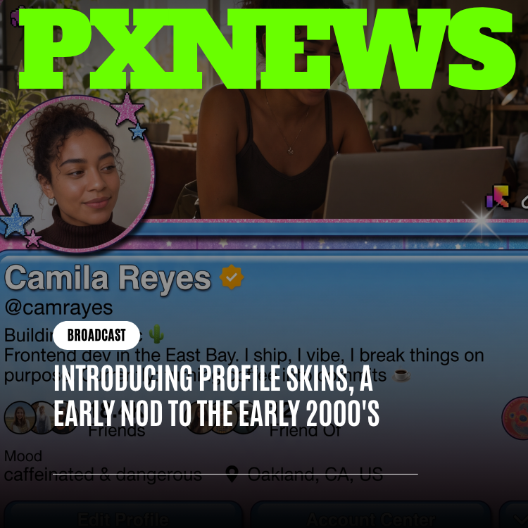
Profile Skins is a customization layer for the Whistlr profile page — color palettes, textures, and layout accents a creator picks to change how their profile actually looks, on top of the same underlying structure everyone shares. It is a deliberate nod to that early-2000s instinct toward profile-as-personal-space, reimagined for a modern live-streaming profile rather than an attempt to literally rebuild any specific product from that era. We are not shipping auto-playing audio or copying anyone's exact layout language. We are borrowing the underlying idea — that a profile page is a canvas a person owns, not a form they fill out — and building it for a profile that also has to host a live video player, a Gems button, and a Storefront link without breaking on a five-inch screen.
We picked that era specifically, not nostalgia in general, because it was the last stretch of the mainstream web where the profile page itself was the creative act. Before algorithmic feeds decided what you saw, a profile was a destination someone had to choose to visit, and what greeted them was whatever the owner had chosen to build: a color scheme that clashed on purpose, a layout that broke the grid because breaking the grid felt like a signature, a soundtrack, a mood. None of that required permission from a design system. It required a text editor and the willingness to make something a little ugly in the name of making it unmistakably yours. That is the instinct Skins is reaching for — not the specific pixels of any one product from that era, but the posture: a profile as a made thing, not a filled-in thing.
That constraint is why Skins is a layer, not a free-for-all. The parts of a profile that carry real function — the go-live indicator, the Gems flow, the tab structure that gets a viewer to Storefront or a creator's socials — stay consistent and legible no matter which skin is active. What changes is the surface around them: the palette, the background treatment, the accent styling on cards and buttons. A viewer should never have to relearn how to send Gems because a creator picked a different skin. They should just immediately know, from the first half-second, whose profile they landed on, the same way you used to know whose MySpace page you were on before the background finished loading.
The Tradeoff We're Naming Instead of Hiding
Every customization feature trades some consistency for some expression, and platforms that pretend otherwise are usually the ones that quietly walk it back later. Full creative freedom on a profile page is how you end up back at unreadable backgrounds and six-second loads. Full lockdown is how you end up with the flattened grid we started with. Skins is us picking a specific point on that line on purpose: a bounded set of visual choices, wide enough that two creators' profiles genuinely look different, narrow enough that nothing a creator picks can make Gems, Storefront, or the go-live state harder to find or slower to load. We would rather ship a smaller set of options that stays fast and legible than a large one we have to quietly restrict six months from now once it turns out someone built a skin that hides the tip button.
Where This Sits in the Rest of the Identity Stack
Skins is not the only place Whistlr lets a creator build an identity beyond the content itself. Storefront already lets creators sell physical and digital goods off their profile, and PX Shop does the same thing for ETAPX's own merch. Circuits and Flow give a creator close-circle and feed surfaces that are not just the main broadcast. The WTC tab inside Creator Studio, unlocked once a creator applies for and gets approved on a Business+ account, is where a creator publishes and prices the Gems a viewer can send during a stream. Skins joins that list as the visual layer underneath all of it — the thing a viewer sees before they ever open a tab, decide to watch, or reach for a Gem. A creator running their account through Whistlr Creator Studio at whistlr.studio can style that identity from the same place they manage Earnings and publish on WTC, so the profile a viewer meets inside the app and the one a brand partner meets on the standalone Studio site stay recognizably the same person.
Rolling Out, and What We're Watching
Profile Skins ships as an early set of palettes and layout accents, not a finished catalog — we would rather put a small set in front of thousands of creators and see which combinations people actually reach for than guess at a hundred options nobody uses. If a particular palette or texture becomes the thing everyone recognizes a certain kind of streamer by, that is the signal we are watching for, the same way the early web's most memorable profiles became recognizable through repetition, not through an infinite menu of choices nobody could actually navigate. A profile was never supposed to be a form. It was supposed to be a room. We are just building a modern one, with the video player and the Gems button already inside it, and the door left open for a creator to decorate the rest.
Frequently asked questions
What are Profile Skins on Whistlr?
Profile Skins is a customization layer for the Whistlr profile page. Creators pick color palettes, textures, and layout accents to change how their profile looks, on top of the same underlying structure every profile shares. It is a nod to early-2000s profile culture, when a profile was a space people decorated, reimagined for a modern live-streaming profile rather than a copy of any product from that era.
Can a Profile Skin hide the Gems button or go-live indicator?
No. Skins is a bounded layer, not a free-for-all. The functional parts of a Whistlr profile, including the go-live indicator, the Gems flow, and the tabs that lead to Storefront and a creator's socials, stay consistent and legible no matter which skin is active. Only the palette, background treatment, and accent styling on cards and buttons change, so viewers never have to relearn how to send Gems.
Why do Profile Skins matter for live streamers?
On a live platform, a profile is often the first thing a stranger sees before deciding whether to stay. A distinct profile signals that a real person with taste runs the stream, gives repeat viewers something to recognize instantly, and separates a creator from the platform's own look. On Whistlr, where viewers send Gems mid-stream, that first impression does economic work, not just aesthetic work.
Can I customize my Whistlr profile from Creator Studio?
Yes. A creator running their account through Whistlr Creator Studio at whistlr.studio can style their profile from the same place they manage Earnings and publish Gems on the WTC tab. That keeps the profile viewers see in the app and the one partners see on the Studio site recognizably the same. Profile Skins launches with an early set of palettes and layout accents rather than a finished catalog.