Product · July 27, 2026 · 7 min read
Why Whistlr Rebuilt the Profile Page Around What Is True Right Now
Whistlr replaced its static profile with a live snapshot that leads with current status — and it matters most in the seconds before someone clicks in.
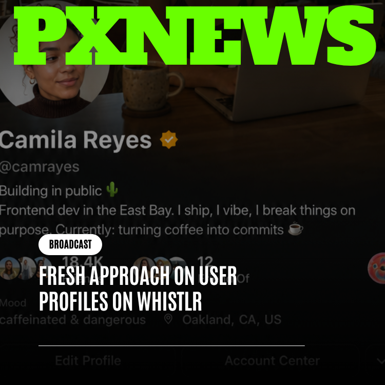
The old Whistlr profile worked like a resume: photo at the top, a bio underneath, a static row of stats, then a grid of past content — every element given the same visual weight regardless of whether it was from an hour ago or two years ago. It was organized, legible, and completely wrong for what a profile actually needs to do on a platform where the whole point is finding out who's active right now. The rebuilt profile throws that structure out and leads with the present tense instead: current Mood, a Blip actually in motion, a video banner instead of a static photo. Here's why that change matters, and why it matters most in the exact three seconds before someone decides whether to click into your stream.
The problem with a resume-shaped profile
A resume treats everything on it as equally true, forever, because that's how a resume works — a degree from eight years ago and a job you started last month sit in the same font, at the same weight, both presented as settled fact. That's fine for a resume, because the reader already knows to check dates. It's a bad model for a profile, because nothing on the old layout told you what was current. A profile photo from two years ago carried the exact same visual authority as a status update posted this morning. There was no way to look at the page and know, at a glance, whether the person behind it was active five minutes ago or hadn't logged in since spring.
That's a real cost on a platform built around live activity. If a viewer lands on a creator's profile trying to decide whether to check out their stream, a stale, resume-shaped page answers the wrong question. It tells them who this person has been. It doesn't tell them what's happening right now, and "right now" is the only thing that actually matters for a decision about whether to click into a live stream in the next ten seconds.
The new model: presence over paperwork
The redesign is built around a single design principle the team calls "presence over paperwork" — a profile should feel like walking into a room where someone is standing right in front of you, not like opening a filing cabinet and reading their history. Concretely, that means the elements most likely to be current get top billing: your Mood status, a Blip that's actually moving rather than a frozen thumbnail, and a video banner instead of a static photo. Older, more permanent information — your bio, your longer-term stats — still exists, but it's no longer competing for the same visual real estate as the thing that changed an hour ago.
| Old layout | New layout |
|---|---|
| Static photo at top | Video banner — motion signals activity |
| Bio and stats given equal weight to everything else | Current Mood leads, older info recedes |
| Grid of past content, undated visually | Blip in motion — a live, present-tense signal |
| Every element reads as equally "current" | Recency is visually obvious at a glance |
It's worth being specific about why this isn't just a visual refresh. A layout change that swapped a square photo for a circular one would be cosmetic — nice to look at, no functional difference in what the page communicates. This is a different kind of change, because it alters what question the page is answering. The old layout answered "who is this person, generally, based on everything they've ever posted." The new one answers "what is true about this person right now," which is a completely different question with a completely different correct answer for someone who streamed an hour ago versus someone who hasn't logged in for a month, even if their bios read identically.
Why this matters most for a creator's own profile
Every Whistlr user has a profile, but streamers have the most riding on this specific redesign, because a creator's profile is frequently the very last thing someone checks before deciding whether to click into a live stream. That's a much higher-stakes moment than a casual social scroll. A viewer who's never watched you before, seeing your name shared or clipped somewhere, is going to glance at your profile for maybe two or three seconds before deciding whether you're worth their time right now. A resume-shaped page answers a question — who is this person, generally — that isn't the one they're actually asking.
A stale profile doesn't just look inactive. It actively undersells a creator who is, at that exact moment, live and worth watching.
This is the real cost of a resume-shaped profile for an active streamer: it can make someone who's genuinely on right now look identical to someone who hasn't streamed in a month, because the page doesn't distinguish between the two. A video banner, an in-motion Blip, and a current Mood do the opposite — they make activity visually unmistakable before anyone reads a word. Someone landing on your profile shouldn't have to dig through a bio to figure out if you're active. It should be obvious in under a second.
There's a discovery angle here too, separate from the returning-viewer case. Someone who's never heard of you, scrolling through profiles after finding one creator they like, is essentially skimming a stack of these pages looking for a reason to stop. A resume-shaped profile gives them nothing to differentiate on except follower count, which rewards creators who are already large and tells a newer streamer's profile to look identical to an inactive one. A living profile gives every active creator, regardless of size, the same visual signal available to them: something moving, something current, something that reads as "on" rather than "archived." That's a fairer playing field for anyone still building an audience.
What to actually do with a living profile
A profile designed to show what's current only works if you keep feeding it something current to show. The redesign did the structural work; it doesn't automatically make a profile that hasn't been touched in three weeks look alive. Treat the elements that lead the page — Mood, Blip, banner — as part of your regular routine around a stream, not a one-time setup step you did on day one and forgot about.
- Update your Mood before you go live, not after — it's one of the first signals a visitor sees, and "about to go live" or "streaming now" reads completely differently from a status set two weeks ago.
- Keep your Blip current enough that it actually reflects something recent, since a stale Blip undercuts the whole point of leading with motion.
- Treat your video banner the way you'd treat a stream thumbnail — worth revisiting periodically, not something you set once and never touch again.
- Check your own profile the way a first-time viewer would: does it look like someone active right now, or someone who used to be?
The tradeoff nobody talks about with a live-first profile
A design built around recency has an honest cost: it's less forgiving to a creator who's been away for a while. A resume-shaped profile flatters inactivity a little, because a two-year-old photo and a two-year-old grid still look complete even if nothing has happened since. A living profile doesn't offer that same cover — if your Mood hasn't been touched and your Blip is frozen, the page reads as inactive because, functionally, it is. That's not a bug in the redesign. It's the same honesty that makes the page useful when you are active, applied consistently even when you're not. The fix isn't a design workaround — it's treating your profile as something to tend, the same way you already treat your actual stream.
The broader point
Presence over paperwork isn't just a slogan for one redesign — it's a fair description of what Whistlr is trying to be as a platform, distinct from social networks built primarily around an archive of the past. A resume tells you who someone was. A live snapshot tells you what's true right now. For a platform built on live streaming, where the entire premise is that something happening right now is worth more attention than something that happened yesterday, that's not a cosmetic choice. It's the correct model for how the whole page should have worked from the start.
Frequently asked questions
What changed in the Whistlr profile redesign?
Whistlr replaced its resume-style profile, where a photo, bio, stats, and a grid of past content all carried equal visual weight, with a layout that leads with what is current. The new profile puts your Mood status, a Blip in motion, and a video banner up front. Your bio and longer-term stats still exist, but they no longer compete with the things that changed recently.
What does "presence over paperwork" mean on Whistlr?
"Presence over paperwork" is the design principle behind Whistlr's rebuilt profile page. It means a profile should feel like someone standing in front of you, not a filing cabinet of their history. In practice, the elements most likely to be current, such as Mood, an in-motion Blip, and a video banner, get top billing, while older and more permanent information recedes.
Why does the new Whistlr profile matter for streamers?
A creator's profile is often the last thing a viewer checks before deciding whether to click into a live stream, usually for just two or three seconds. The old layout could make an active streamer look identical to someone who hadn't streamed in a month. A video banner, a moving Blip, and a current Mood make activity obvious at a glance, giving active creators of any size the same visual signal.
How do I keep my Whistlr profile looking active?
Update your Mood before you go live, not after, and keep your Blip current enough to reflect something recent. Revisit your video banner periodically, the way you would a stream thumbnail. Then check your profile as a first-time viewer would and ask whether it looks like someone active right now. The redesign is less forgiving of inactivity, so it needs regular attention to look alive.